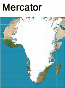
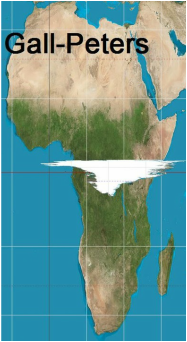
| One of the definitions of word "perception" is the ability to see, hear, or become aware of something through the senses as opposed to reason. If this word is put in the search bar on our ATVC Website, there are nine citations. We need to understand the difference between our needs and wants when building communication skills to resolve conflicts on every level. How we judge what makes an individual or a community function well involves continually clarifying stimuli (what we see, hear, etc). The 2015 John Looney Intern studied the Arno Peters Map as an exercise in clarifying perceptions. The following is a portion of her findings. On my first day as a John Looney Intern, I saw the Arno Peters Map hanging in the American Friends Service Committee office. I absolutely loved the map the moment I understood its premise. The Peters Map has parallel latitude and longitude lines (which is important for knowing relative positions), but it also demonstrates an accurate depiction of area. Compare this to the most popular map projection – the Mercator projection. This projection is based on the cylindrical projection (which you can search for online since I don't have the space to explain it here). This means that at the Equator, the map's depiction is absolutely correct, but the farther North or South countries are positioned, the more they grow and the more they get distorted. I love the Peters map because it shows Africa as the huge continent that it is, and significantly reduces Greenland to the proper size. I have nothing against Greenland, but considering that Greenland is 0.8 million sq miles while the whole of Africa is 11.6 million sq miles, it is unfortunate that they look about the same size on the Mercator map. I would like to make two observations about the Peters map: The first is that the Peters map looks distorted, stretched, and funny looking, compared to what we're used to with the Mercator projection. It serves as a good reminder that anything that renders a 3-D sphere to a 2-D rectangle is going to have distortions, and the Mercator map has just as many distortions as the Peters map. |
Since January these six blog posts reflect study and application of the 2015 John Looney Internship for Peace, Justice and Nonviolence. We hope something has been helpful. Please look at our newly designed Beginners Guide and please participate on our Discussion Forum.
Submitted by Hannah Yackley
John Looney Intern 2015


 RSS Feed

